Image Gallery:
Note: Some of these images are outragously big, hope you have a fast connection
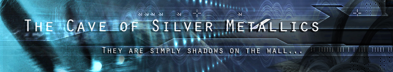
:-: Title banner created for my blog. About six layers done in Photoshop 7.02, all of them from loorolls.com and two more layers for the text effects. It was actually whipped up pretty quickly in less than thirty minutes, and turned out really really well. This has got to be the best title banner I've had yet... I think anyway.
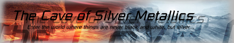
:-: Title banner created for my blog. A whole lotta layer work in Photoshop 7.0, a little bit of touchups for individual layers in Paint Shop Pro 7.02; both background images ripped from looroll.com.
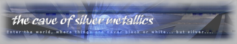
:-: Old version of my title banner. Three different background layers, one of which you can barely see (it's an ocean wave). Made completely in Paint Shop Pro 7.
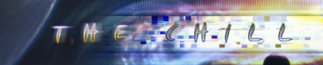
:-: Banner for my posts on online bulletin boards. One of my first pictures. Five layers total, made completely in Paint Shop Pro 6.
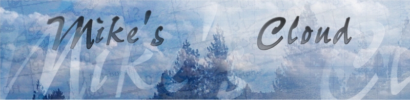
:-: Title picture I whipped up for Mike's website. A lot of experimentation going on with layers and word art. Multiple cloud pictures merged together with random weather charts I found online. There's also a grid layer that no one really knows about in the bottom right.
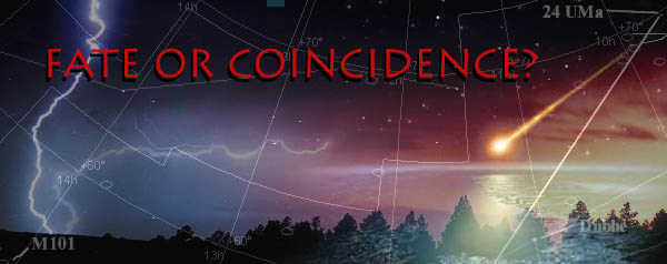
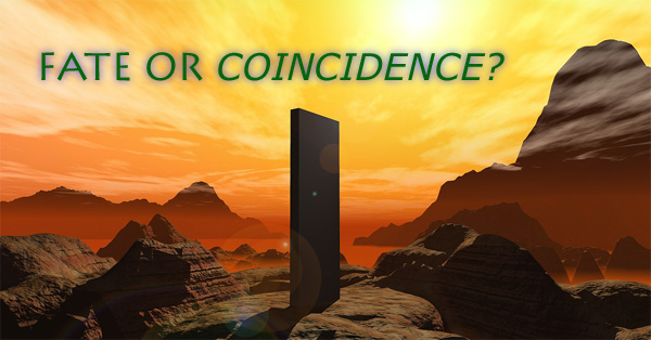
:-: The newest version of "Fate or Coincidence." Featuring four Photoshop 7.02 layers. I had an especially hard time with this one trying to salvage it from looking totally ugly. Plus the colors were all funky and didn't match to well with the site. But here it is, using google images only : )
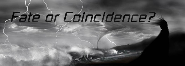
:-: Old Title picture for another site. I actually didn't create the background. In fact, all I really did was add the words with Photoshop 7 : )
:-: This is the same picture, but I digitally colored-in the black and white background in Photoshop 7.02 and re-did the words. I also removed the girl.
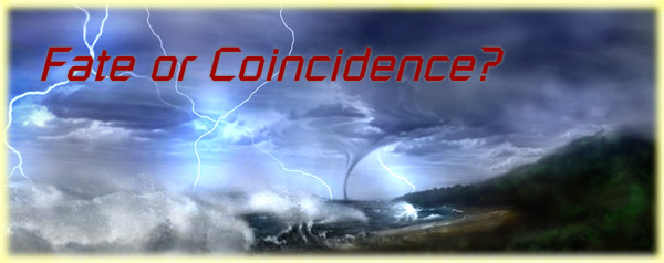
:-: Another attempt at the title picture. Background is from loorolls.com. Just added the words and a little fade layer.
:-: Same as above, but I added boxes around words to better distinguish the title.
:-: Another attempt. A lot of touch up here in Paint Shop Pro 7.02 to make the words have that funky transparency effect.
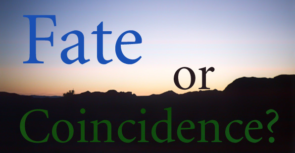
:-: My first experimentation with a radically new and different style: simplicity.
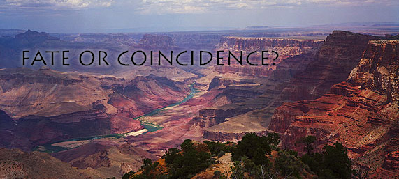
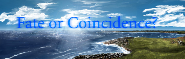
:-: Found a nice picture of the Grand Canyon and put some words on it. I actually think this one looks the best. Clean and simple.
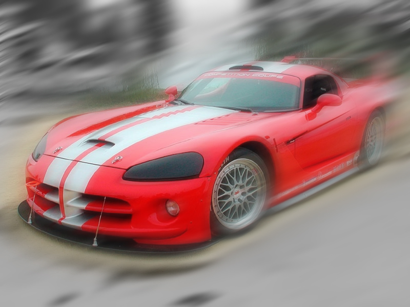
:-: Picture of a still 2002 Dodge Viper GTS-R. Did a cheap chrome effect to it and then put in some custom wind and motion blurring in Photoshop 7.02. My first car picture. Even though it was a really sloppy job, I still think it looks cool.
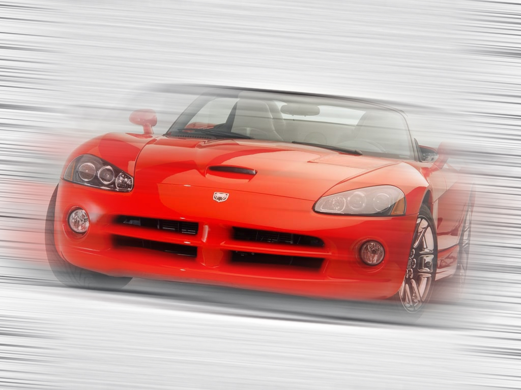
:-: Picture of a 2003 Dodge Viper SRT-10. Experimented with a noise filter and then did some really funky motion blurring to it in Photoshop 7.02.
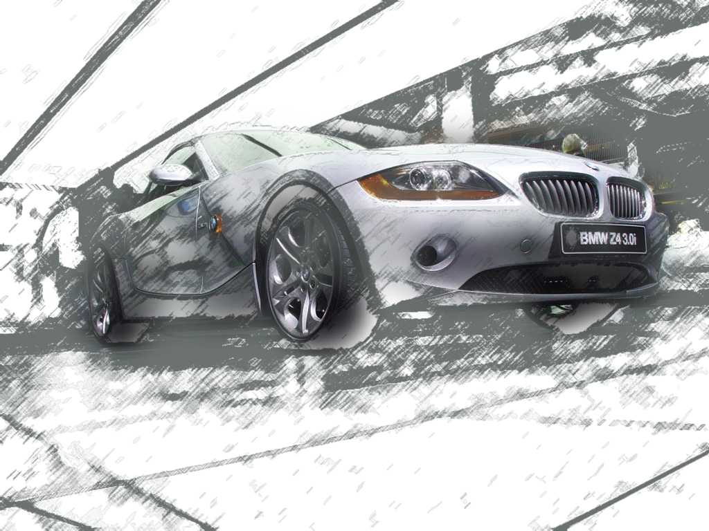
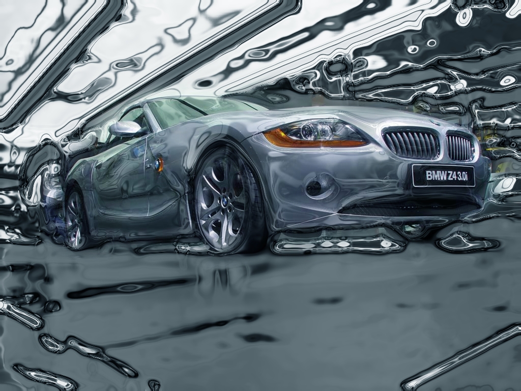
:-: Picture of a 2003 3.0L BMW Z4. A showroom picture that I found and did a lot of filter work in Photoshop 7.02. First a little color management, then a paper filter, chalk filter then a little bit of wind and smoothing, and then a whole lotta history brush work to make it look like a partially colored sketch.
:-: Same as above, but I used what I learned with the history from that one and applied it to this one. This time, I did smoothing first, then a chrome filter, and then some mad history brush skillz to make it have that neato plastic-y effect.
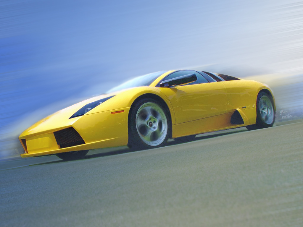
:-: One of my newer car edits. It's of the Lamborgini Mucielago. Spent about 5-6 hours in Photoshop 7.02 alone on this one. It was originally a still picture on a lawn. There's actually three layers here to make it have a faded motion effect. There's a lot of custom wind work here, blurring aplenty, lots of color management and photo touch-ups. I'm very happy with how this one turned out.
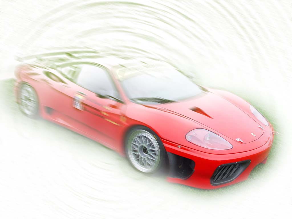
:-: Kind of a hash-crash effort on this Ferrari 360 Modena GT. A little experimentation with radial blurring and history brush work, as well as a paper outline filter.

:-: My colored-in version of the black and white background for the title banner higher up on this page. Used lots of filter settings on the brush work to try to preserve the black on the original image without going over it. The one used in the title banner is simply cut out of this one.
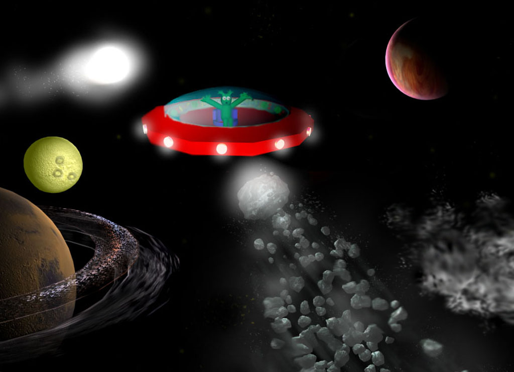
:-: A friend of mine had a space scene drawn in MS Paint. We kinda wondered what it would like like if I did it my way (with Photoshop 7.0 and 3D Studio Max 4.2). So this is what I came up with. Everything here is custom. But it was really fun rendering the alien ship in 3D Studio. There's actually a lot of custom particle effects from 3D Studio in there also, like the rock trail by the meteor moving upwards. Just kind of a fun image whipped up for kicks.
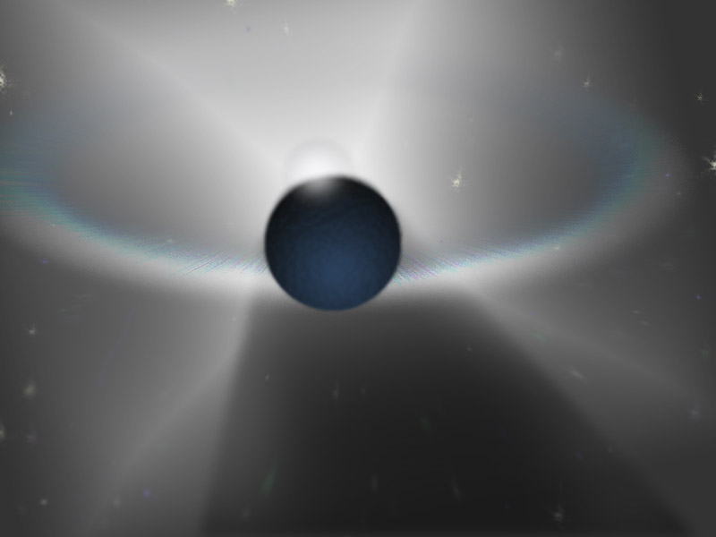
:-: My first venture into completely custom scenes, inspired by by Raymond's ass-kicking brush images. But I quickly found out that I don't know anything about brush work, in fact, I suck dearly at it. So I stuck the cold and direct setting: space. This was created entirely in Photoshop 7.02, about 7 layers here. Three of them the sad attempt to make a "supernova ring." It took forever to make.
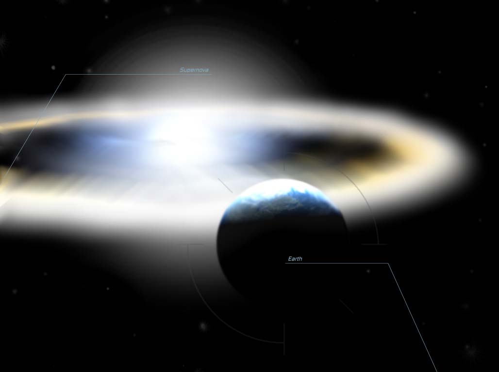
:-: My most recent space picture. Took two days to complete. Again, everything is custom, but this time I used 3D Studio Max 4.2 to help out with the supernova ring and the planet. Then went into Photoshop 7.02 to do some serious blurring work. There's roughly 12 layers here, four of those those HUD-ish lines that I was experimenting with. Probably the image I'm most proud of here in this gallery.
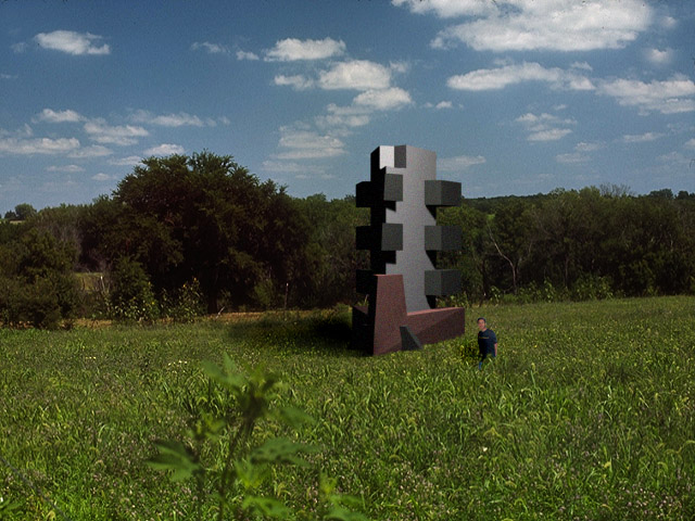
:-: One day in chem class, I sketched up a building in the margin of my notebook and thought it looked pretty cool. So naturally, I figured I'd render it in 3D Studio Max 4.2. Didn't look quite as cool, but since it was there, I might as well put it somewhere. So I went into Photoshop 7.02 and put in the field. Then I got bored, so I put a small picture of me in there too...waist-deep in the shrubbery : P Did a little shadow work and boom, me in some field next to some random building.